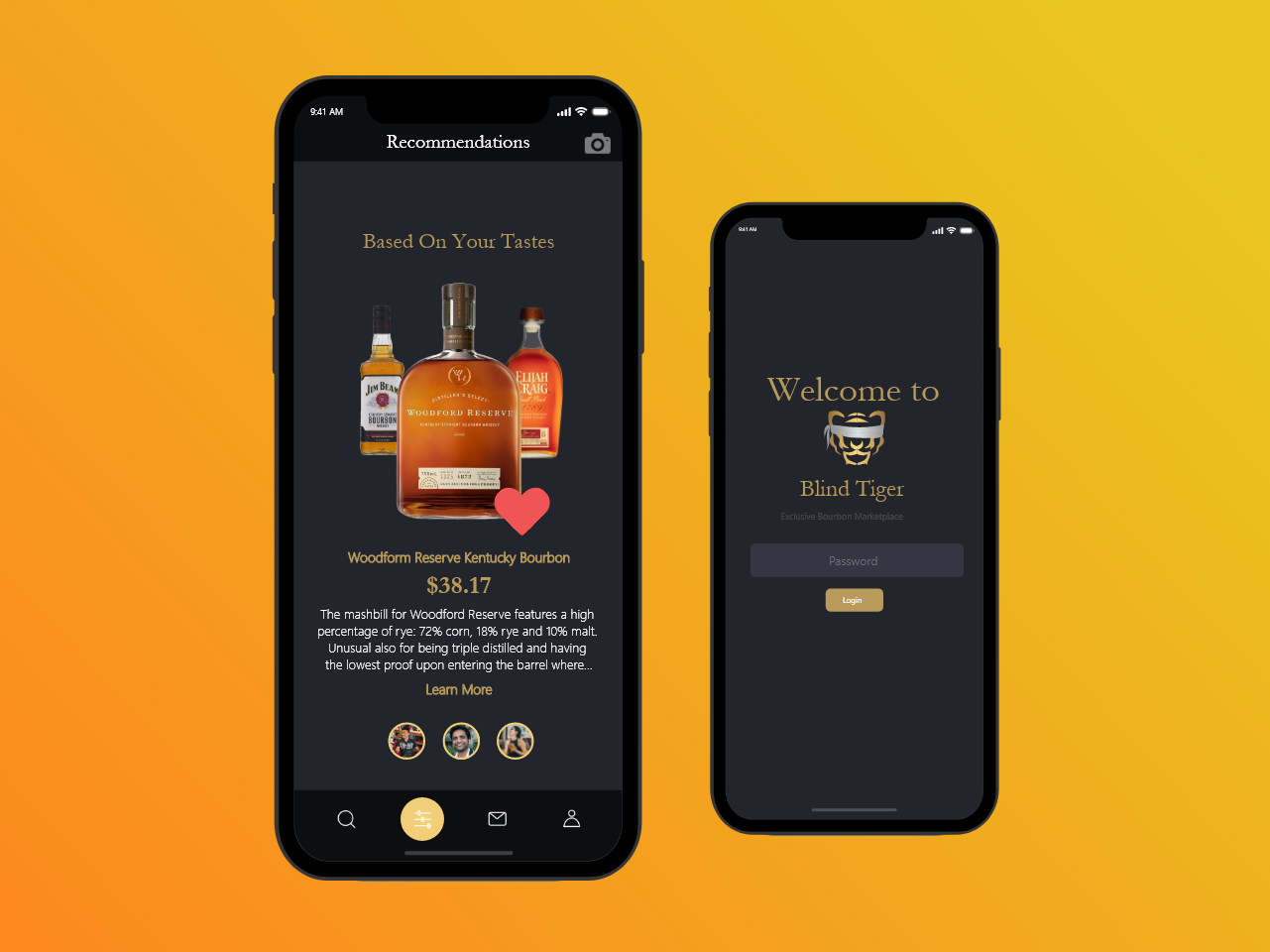
Onboarding/welcome screens with illustrations
Project Overview
Client
Redhorse Corporation (Arlington, VA)
My Role
Visual design, UI/UX
Team members: Ian Carr, Jeevna Prakash (me)
Background
Redhorse Corporation specializes in developing and implementing creative strategies and solutions with private, state, and federal customers in the areas of cultural and environmental resources services, climate and energy change, information technology, and intelligence services. In the summer of 2019, I was hired as a UI/UX designer at Redhorse.
The Challenge
To begin the summer internship, our clients explained that we were the first designers that the company had hired. Previously, developers and project managers would conduct client interviews and ideate system solutions. The clients asked if there was a more official process by which client requirements could be extracted, in line with design thinking methods.
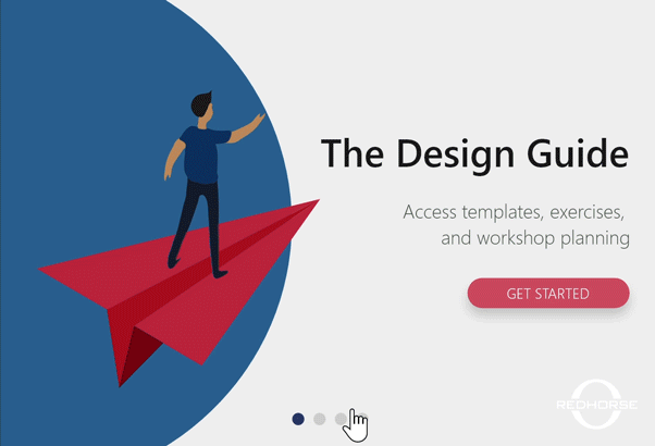
Our solution was to design a pocket toolkit that our client's in-house designers and project managers could use. The purpose of the toolkit is to allow the users to reference it when they are designing workshops and research activities. The toolkit would provide a list of methods, descriptions of the methods, and workshop activities that are based on the methods.
Goals & Envisioned Impact
- Create a marketing tool appropriate for public viewing
- Promote the philosophy of design thinking
- Increase client/customer engagement
- Develop workflow between design and development teams
to be used in future projects with Redhorse clients
My Role
I was a UI/UX designer and lead visual designer. Some of my responsibilities included:
- Developing a visual design system for the application
- Interviewing clients to ascertain branding/theme for the application
- Collaborating on, and critiquing wireframes
- Working with developers to refine and adapt designs based on feasibility
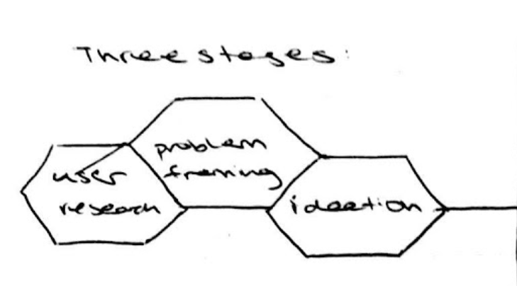
The Process
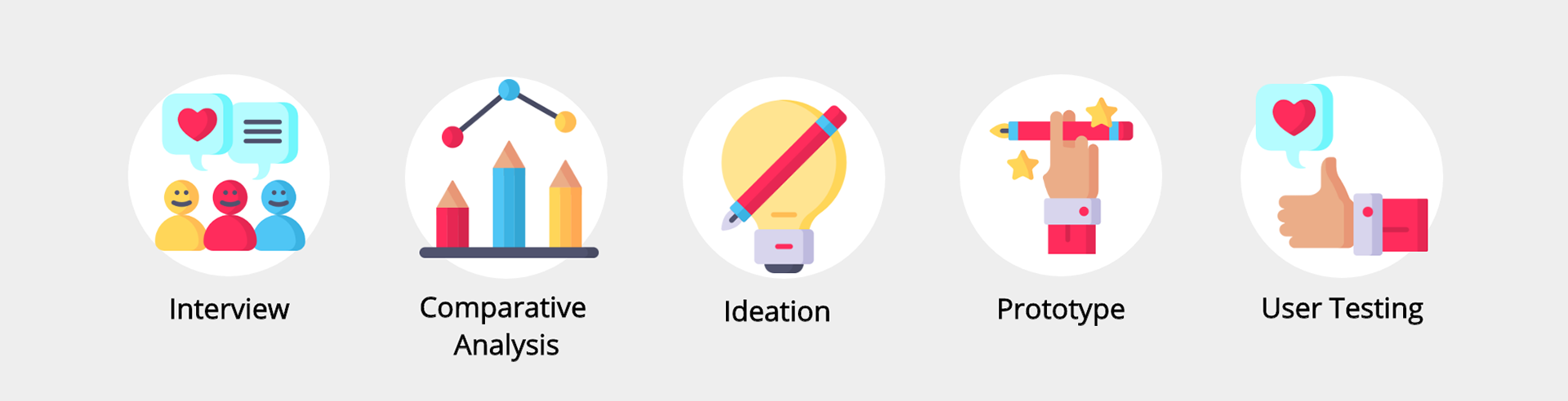
Interview
Interview Goal: We needed to understand what the needs of the users are and how they could benefit from using a design toolkit
Users will reference the design toolkit for two reasons: to explore the methods and build their own workshop
In-house designers and project managers operate using tablets, so the interface should be designed for tablet-use
Many of the users are not well-versed in user research or design. The UI should be intuitive and structured for novice designers that want an easy way to build a workshop or learn about methods
Comparative Analysis
Comparative Analysis Goal: We wanted to see how other reference tools are organized and what their contents consist of
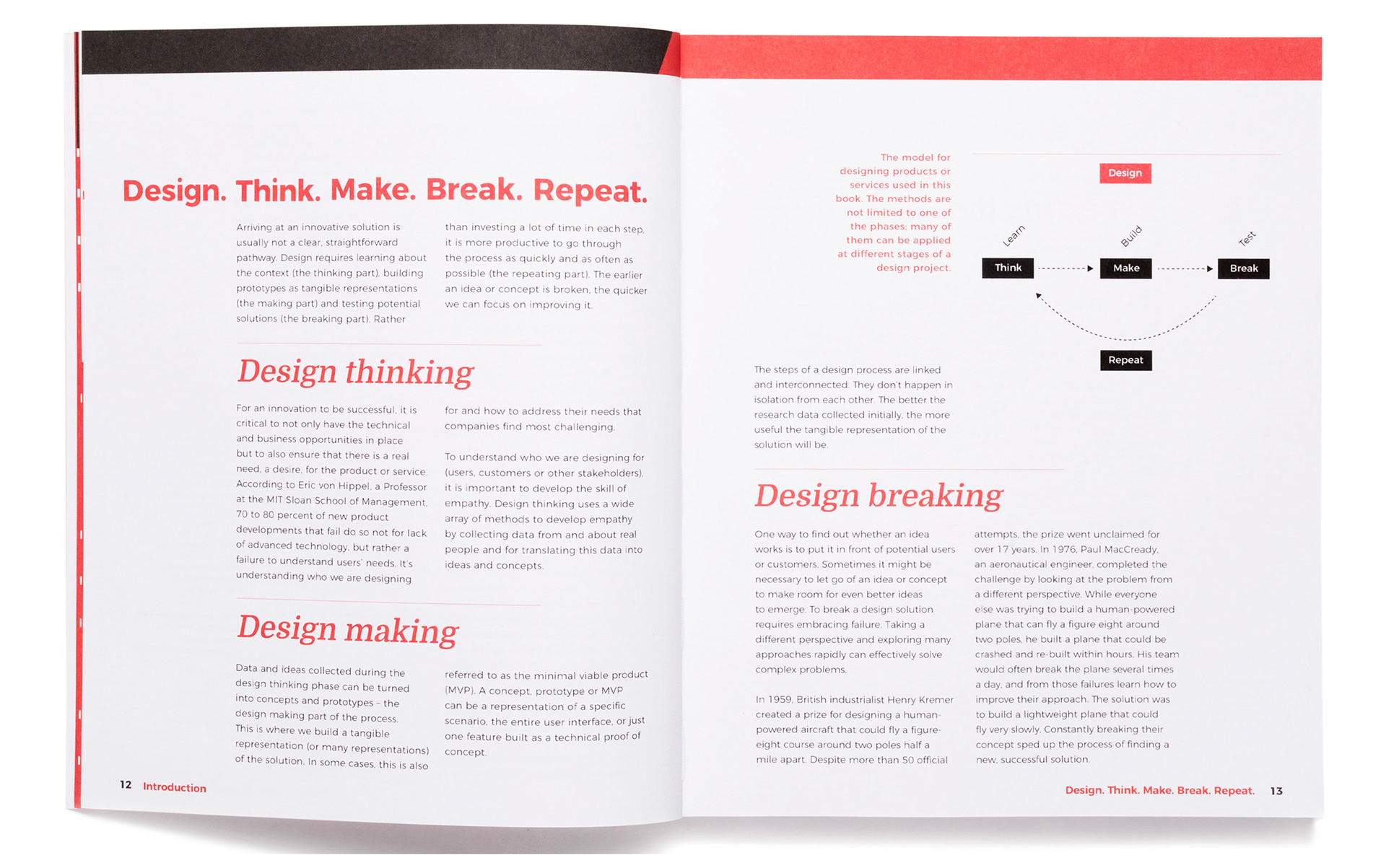
The book “Design. Think. Make. Break. Repeat” was our primary source for how a design reference guide should be structured
Reference tools typically include general descriptions, one or more exercises, and a worksheet that would assist with the exercise
Some reference tools organize the content based on category type, while other tools organize content based on functionality

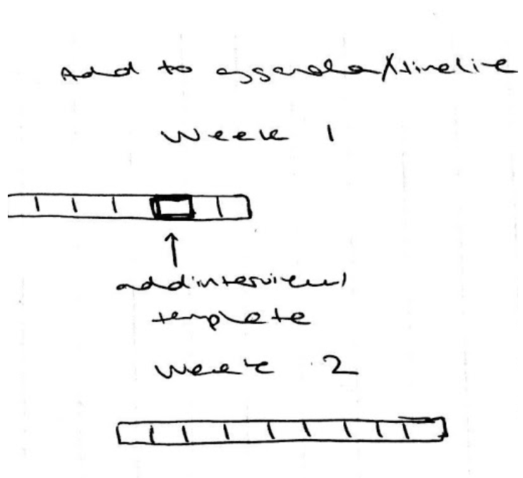
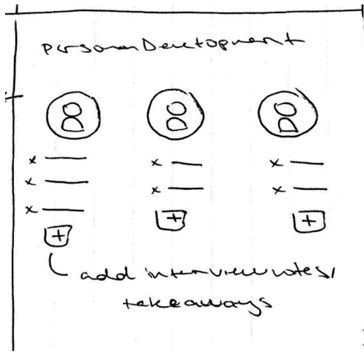
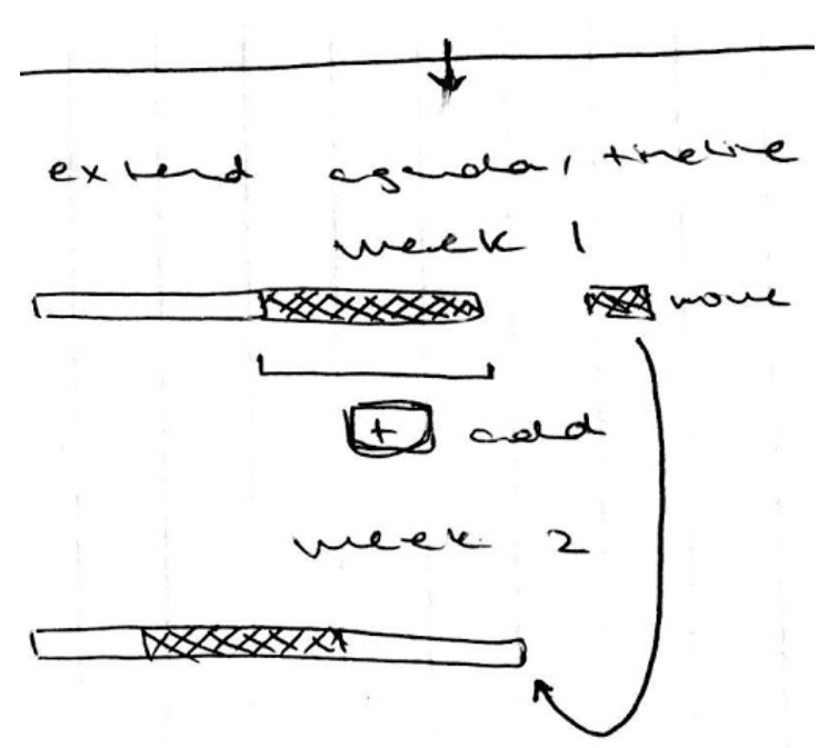
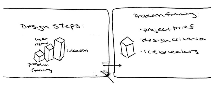
Ideation
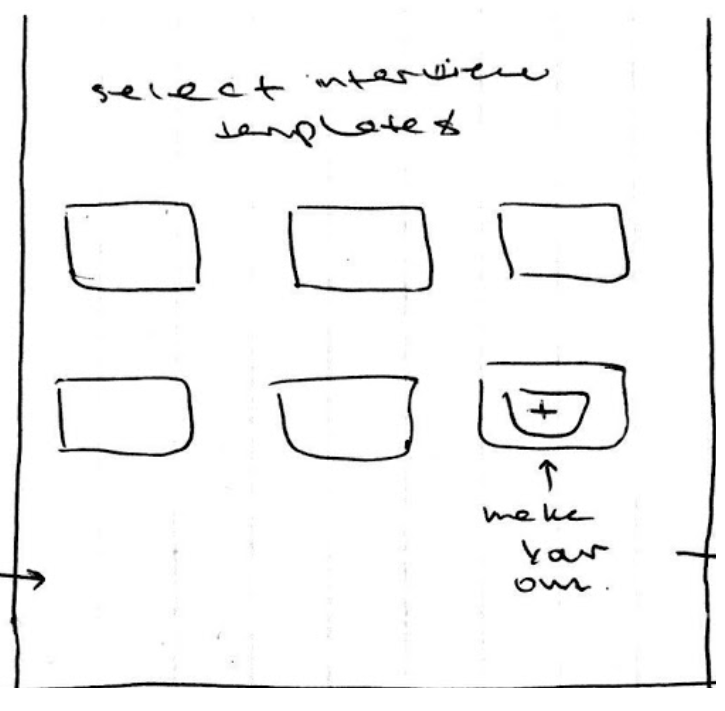
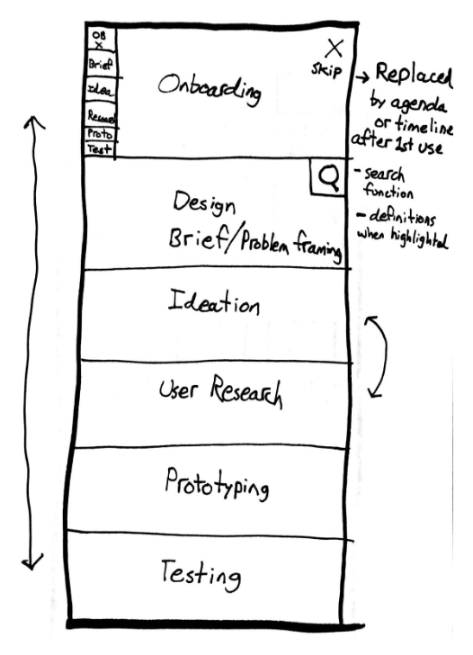
During our ideation phase we discussed the possibilities of the tool in terms of how it should display the workshop templates. Since the templates are mostly formal design methods, they could easily be built using pre-made templates for each exercise. The main decisions we needed to make concerned the usage of these templates by users who are relatively unfamiliar with the process of design thinking or user interviews. We came up with a few different ways for users to search by template, function of the interview, or the type of information ascertained from their clients.
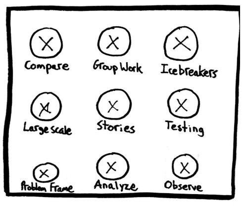
Below are a few sketches of the different ideas we drafted:
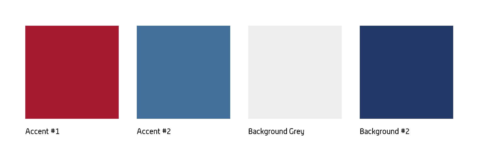
Visual Design
This application presented a unique challenge because our clients wanted the design to be used as an in-house design tool. This meant that the visual design and aesthetic had to be consistent with the company's branding guidelines. Additionally, there were not very detailed branding guidelines to begin with, considering the young age of the company and the lack of similar tools.
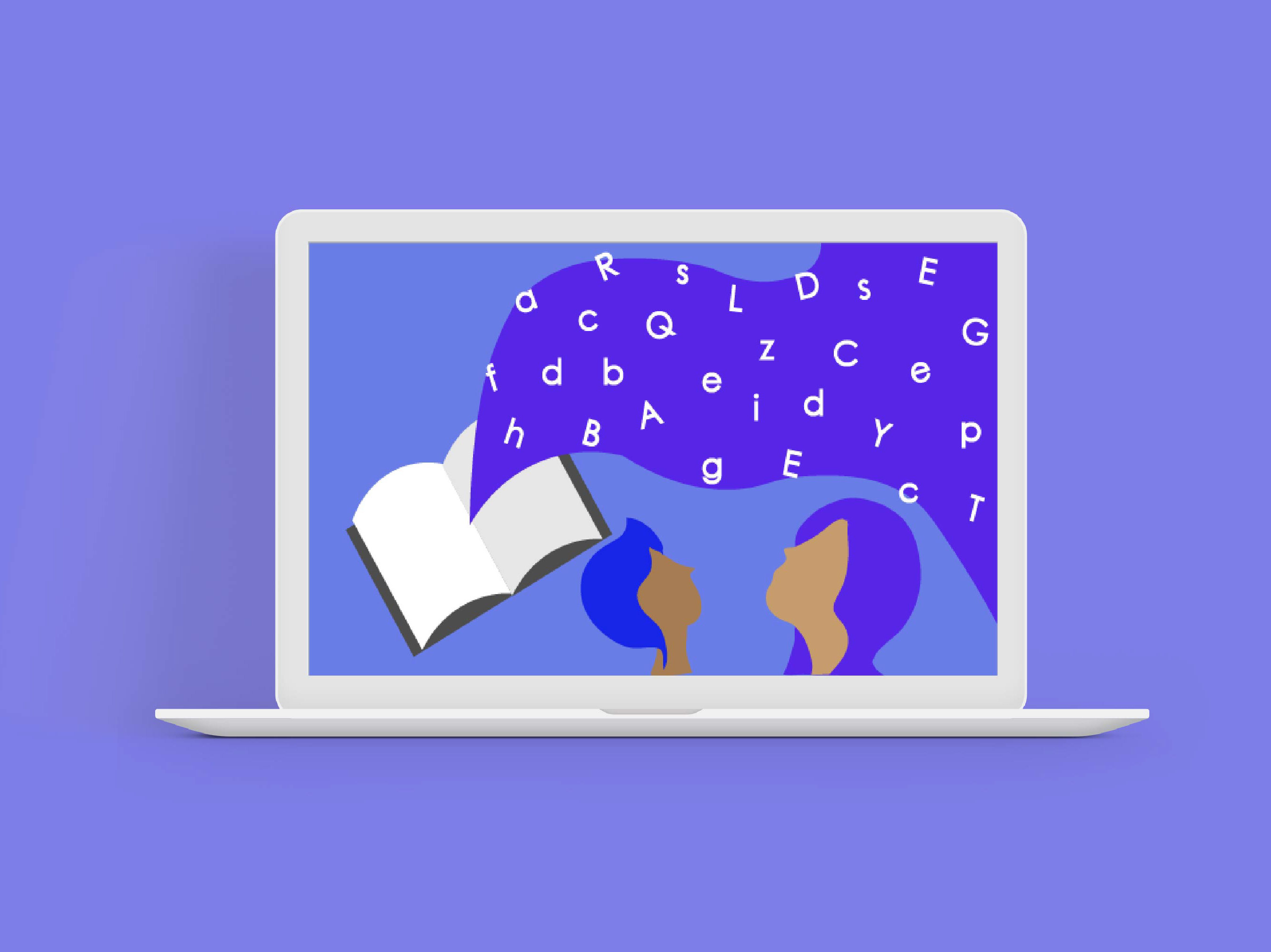
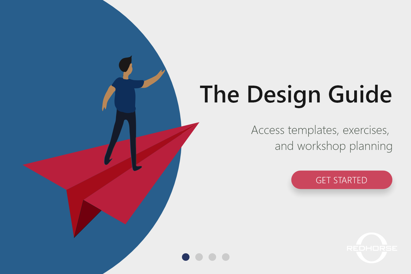
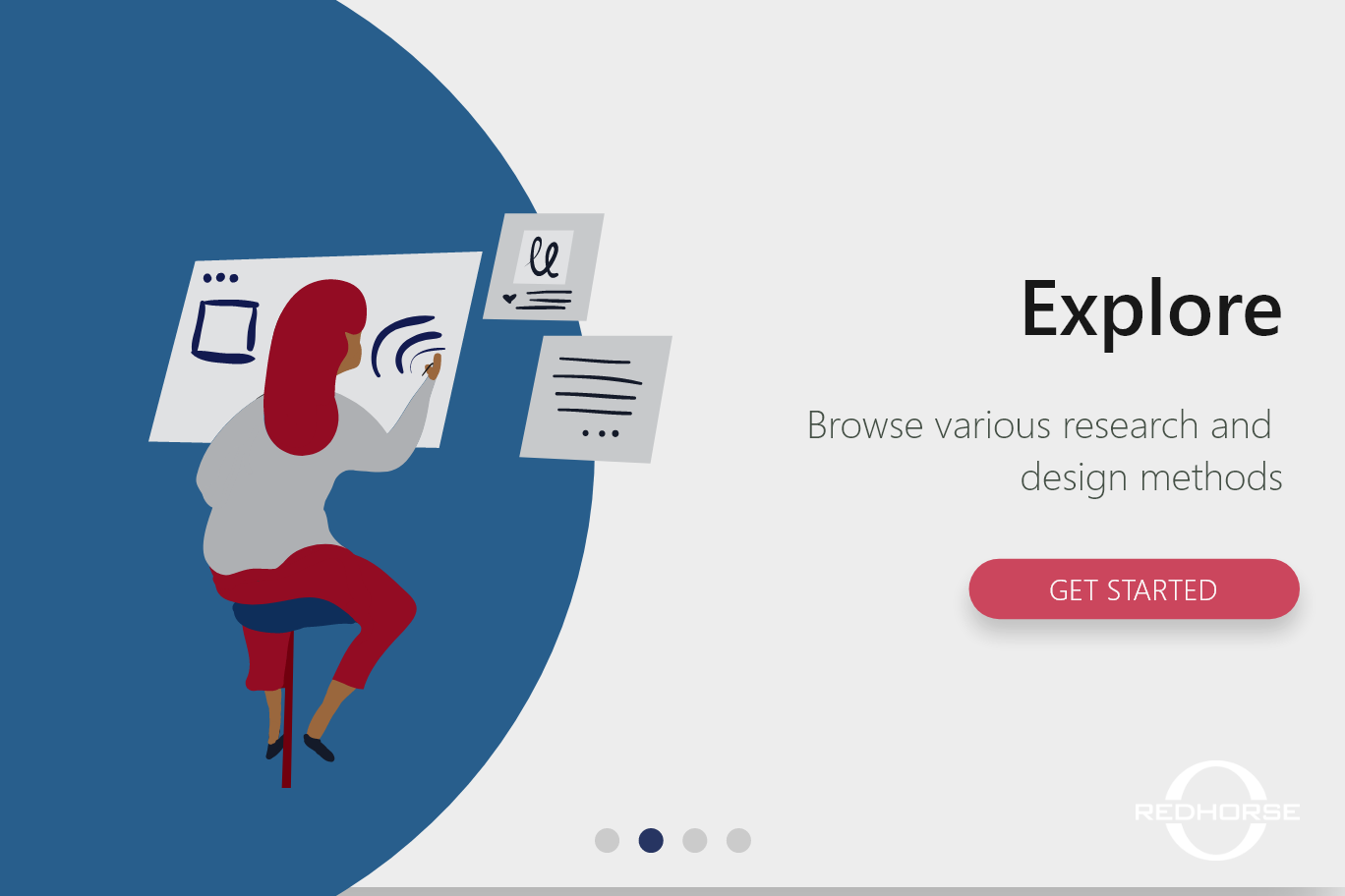
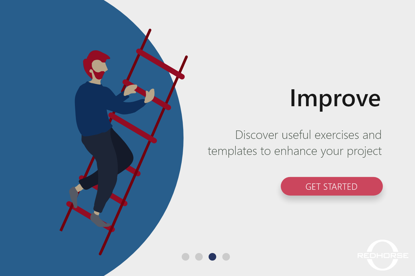
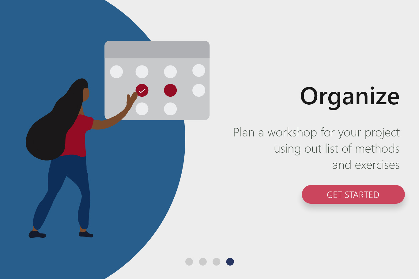
One solution to the unfamiliarity of any similar tools, was to include a friendly onboarding process. A simple 4-swipe tutorial to familiarize a user with the functions and possibilities of the application. As a visual designer on our team, I came up with the following design scheme and styles of illustrations:
Prototype
Low Fidelity Prototype
High Fidelity Prototype
Using our lower fidelity prototypes, our team prototyped high fidelity screens using Adobe XD. The screens are captioned with the functions we ideated for that page. With some user testing we discovered that as many of our colleagues were former military or former government workers, they were partial to a patriotic color pallet. We also found that due to the age of our average user, the interactions we integrated had to have some familiarity with tools they knew how to use.
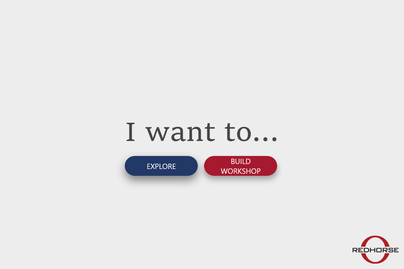
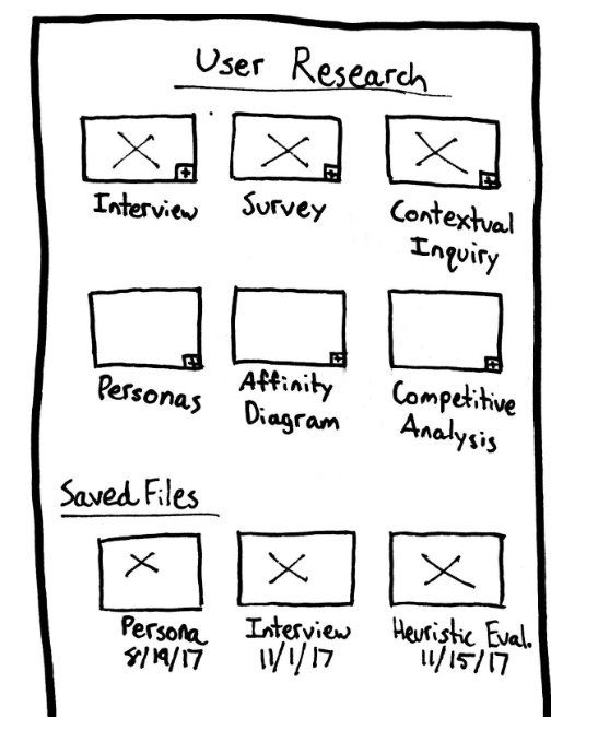
The user has the choice between exploring the different methods that are stored within three function-based categories or begin creating their own workshop.
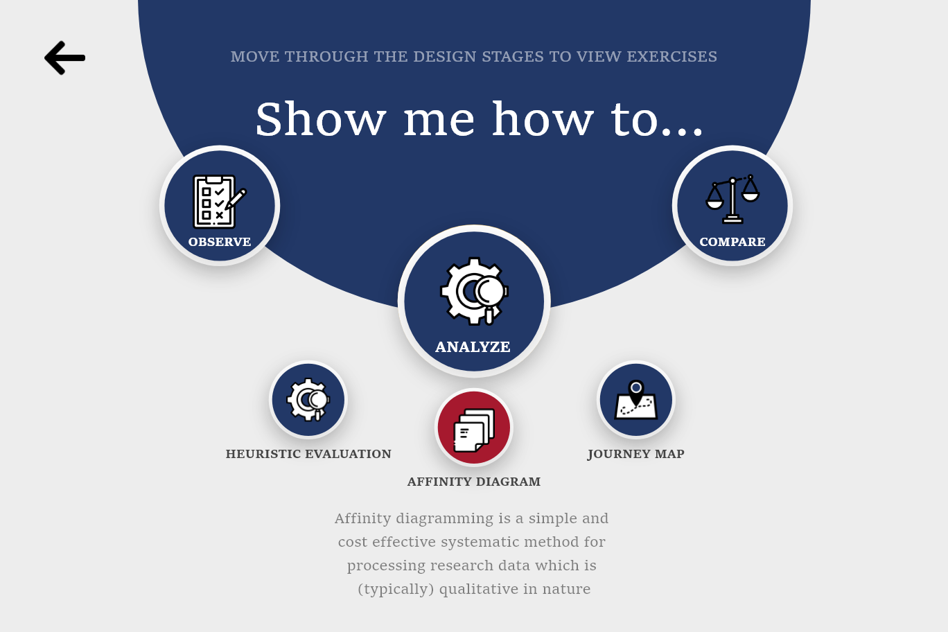
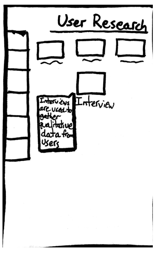
If a user selects ‘explore’ from the previous screen, they are taken to this screen. Users can swipe through the three separate categories: observe, analyze, and compare. Each category has a list of methods that users choose from. When clicking on a method, a short description is displayed beneath it.
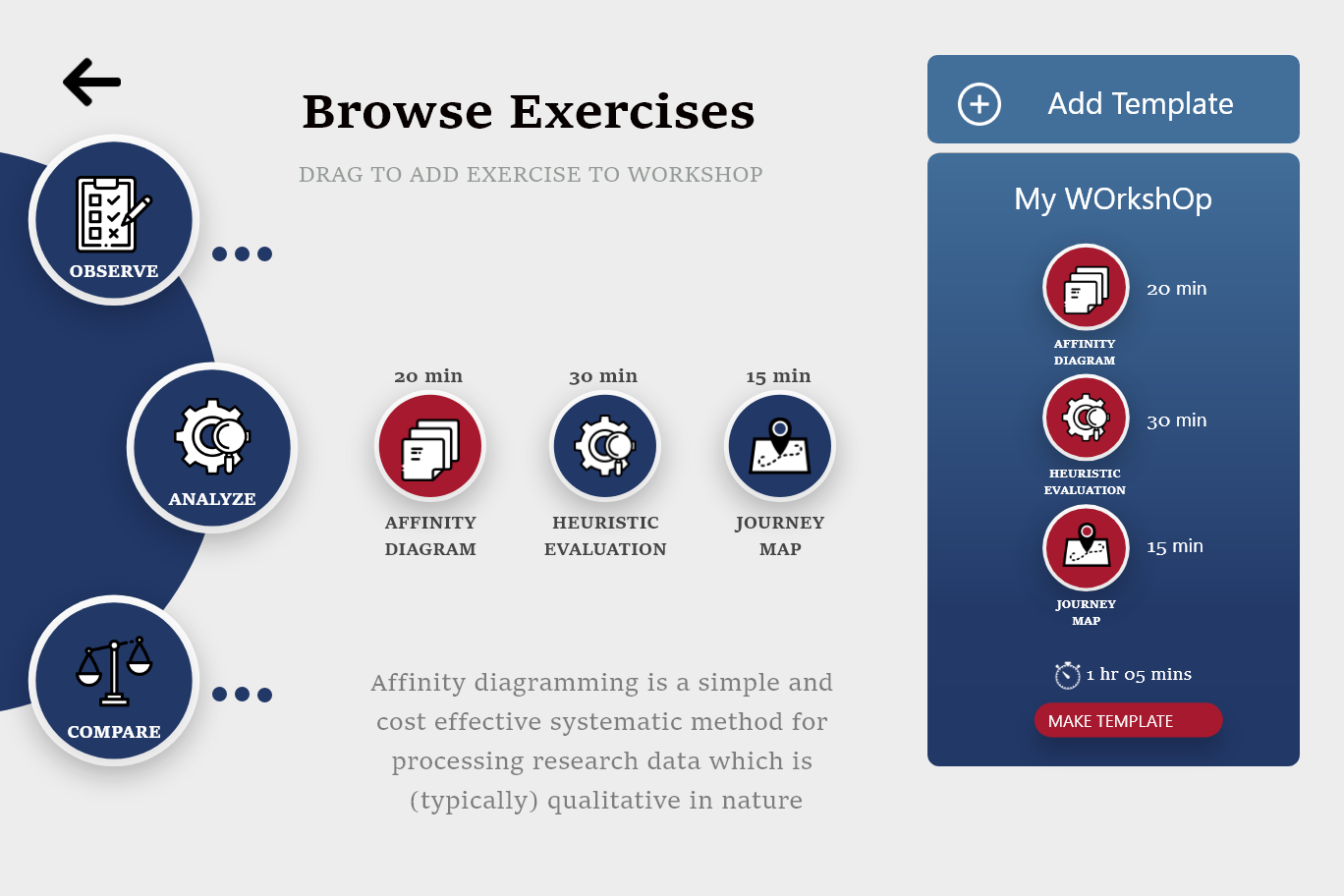
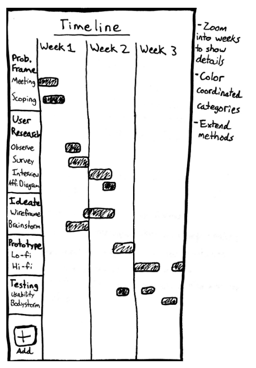
Alternatively, if users select ‘Build Workshop’ instead of ‘Explore,’ they will be taken to this screen. Users can browse the different categories and methods, as well as drag the methods over to the ‘My Workshop’ container. Users can add templates to their workshop and see how long this workshop will typically take to conduct.
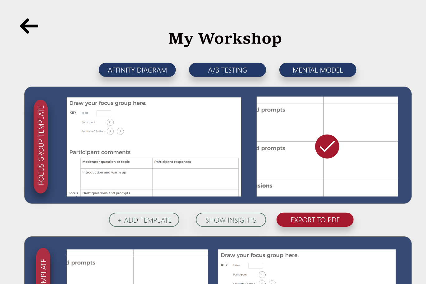
Clicking the ‘Make Template’ button on the ‘My Workshop’ container will bring the user to this page. This screen presents a list of the workshop activities that you have gathered while exploring the toolkit. The user can see every template in a list and has the option to export them as a PDF.
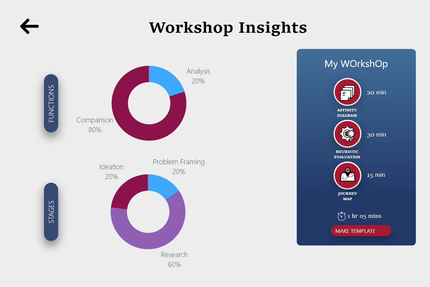
If the user selects the ‘Show Insights’ button on the ‘My Workshop’ screen, they will be taken to this screen. Here, they can see how their workshop is structured. Users can see which functions their workshop focuses on, as well as what percentage of time is spent on each category.
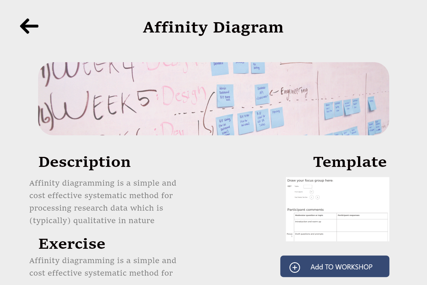
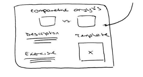
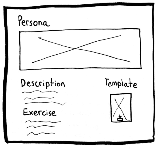
Similar to how previous sketches are structured, the Details screen includes a short description of the method, an exercise that can be used for a workshop activity, and a template that can be downloaded for entering data or to be used as a worksheet.
User Testing
We are currently in the process of user testing among the designers and program managers at Redhorse!
Reflection & Next Steps
It was a very interesting project to take on: teach people with a technical background how to interview like designers. It involved a lot of interviews with non-design people, and explaining the value of design thinking. I was able to share my love for interacting with others, and finding out how to give our users the best possible experience when interacting with an application.
The application is currently being reviewed by Redhorse developers - after user testing, we hope to distribute it for use among Redhorse employees.