Project Overview
Client
Redhorse Corporation (Arlington, VA)
My Role
Visual design, UI/UX
Team members: Ian Carr, Jeevna Prakash (me)
Background
Redhorse Corporation specializes in developing and implementing creative strategies and solutions with private, state, and federal customers in the areas of cultural and environmental resources services, climate and energy change, information technology, and intelligence services. In the summer of 2019, I was hired as a UI/UX designer at Redhorse.
The Challenge
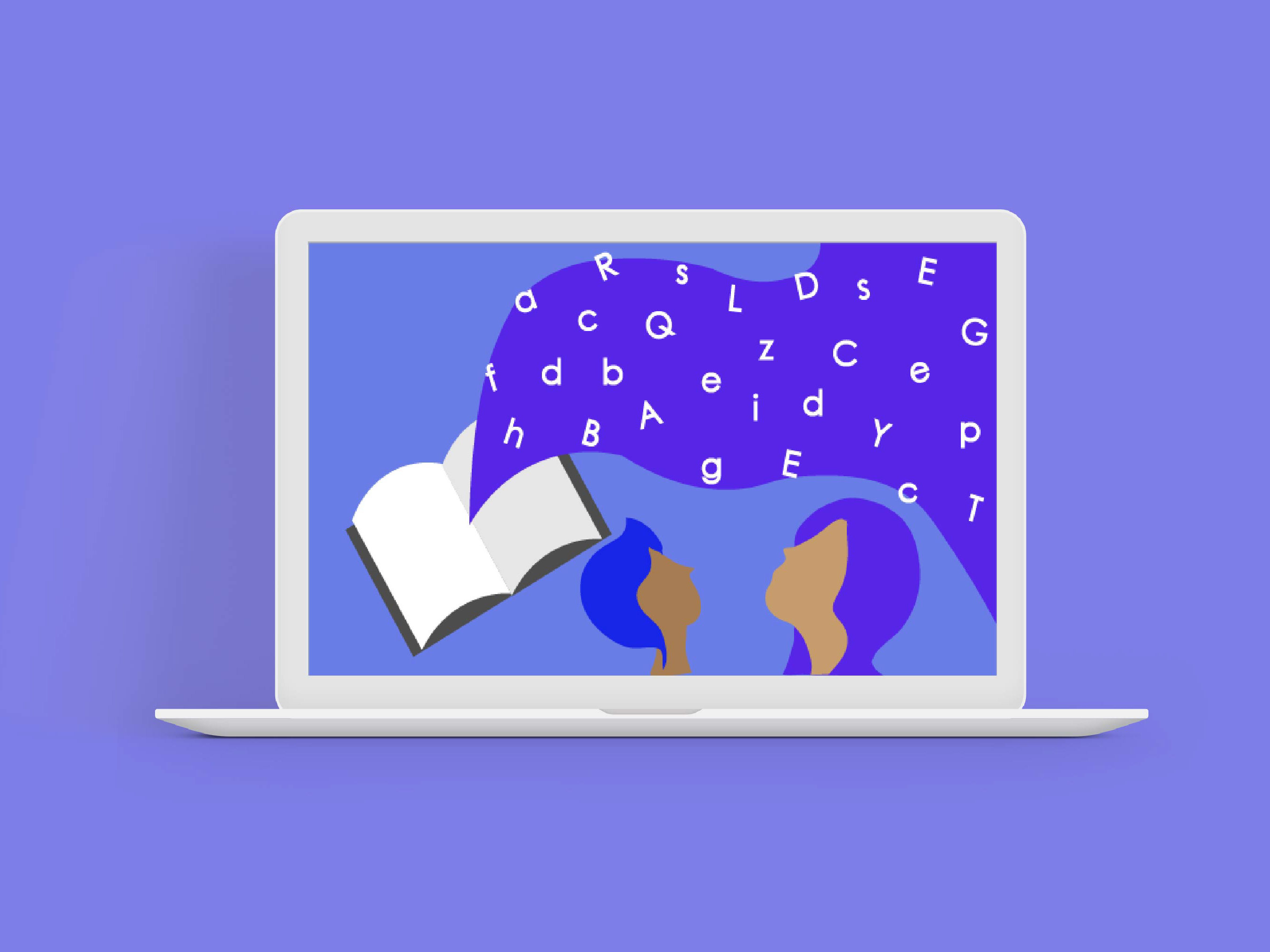
For our second internship project, the design team was tasked with making a tool to display the company's recent developments in knowledge graph creation. After observing the many hobbyist bourbon drinkers in the office, we designed an interactive mobile app for bourbon enthusiasts.
The project was open-ended and our team was given total creative freedom with the research and design methods. Our final product is an exclusive marketplace for bourbon experts and enthusiasts.
Goals & Envisioned Impact
- Create a marketing tool appropriate for public viewing
- Utilize the power of knowledge graphs
- Increase client/customer engagement
- Develop workflow between design and development teams
to be used in future projects with Redhorse clients
My Role
I was a UI/UX designer and lead visual designer. Some of my responsibilities included:
- Developing a visual design system for the application
- Interviewing clients to ascertain branding/theme for the application
- Collaborating on, and critiquing wireframes
- Working with developers to refine and adapt designs based on feasibility
The Process
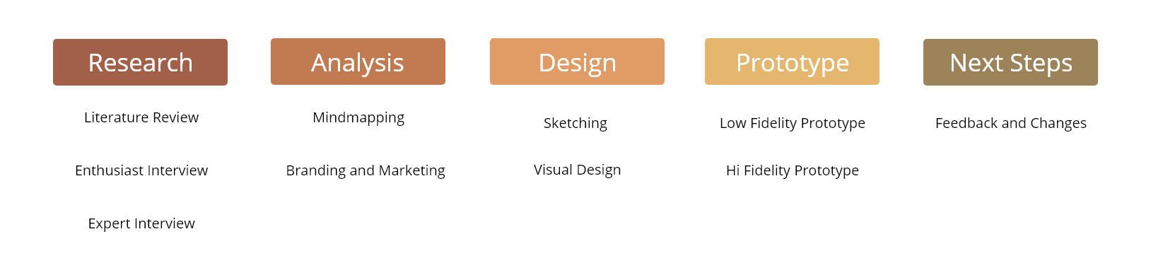
Research
Interview w/ enthusiasts
Goal: We need to better understand what bourbon enthusiasts would want from a bourbon app and how they would want to use it
Non-expert reviews are avoided when seeking high-end products
Local experts are the primary source of knowledge for suggestions or reviews
Enthusiasts would like to scan labels or restaurant menus to compare prices or find similar products
Enthusiasts enjoy learning about the history and science behind bourbon products
Interview w/ experts
Goal: We wanted to see how bourbon distillers, marketers, and influencers conduct their business and how they catered to their customers
Stories and bottle design interest customers to buy the first bottle; expertise secures further interest to return to the distillery
High-end clientele enjoy the feeling of having an exclusive expert that they can contact for rare merchandise; the feeling that “I know a guy”
Facebook and text messaging is typically how business managers market their exclusive inventory to their loyal consumers
Secondary Research & Analysis
Goal: We wanted to expand our vision and see what online bourbon enthusiasts are interested in and how websites and magazines cater to their interests
Enthusiasts enjoy using flavor profiles to receive suggestions they may like
Websites and magazines typically follow a similar dark-theme layout
Enthusiasts use social media to share what they are purchasing and drinking
When purchasing high-end products, consumers need information about the provenance to make sure the purchase is reliable
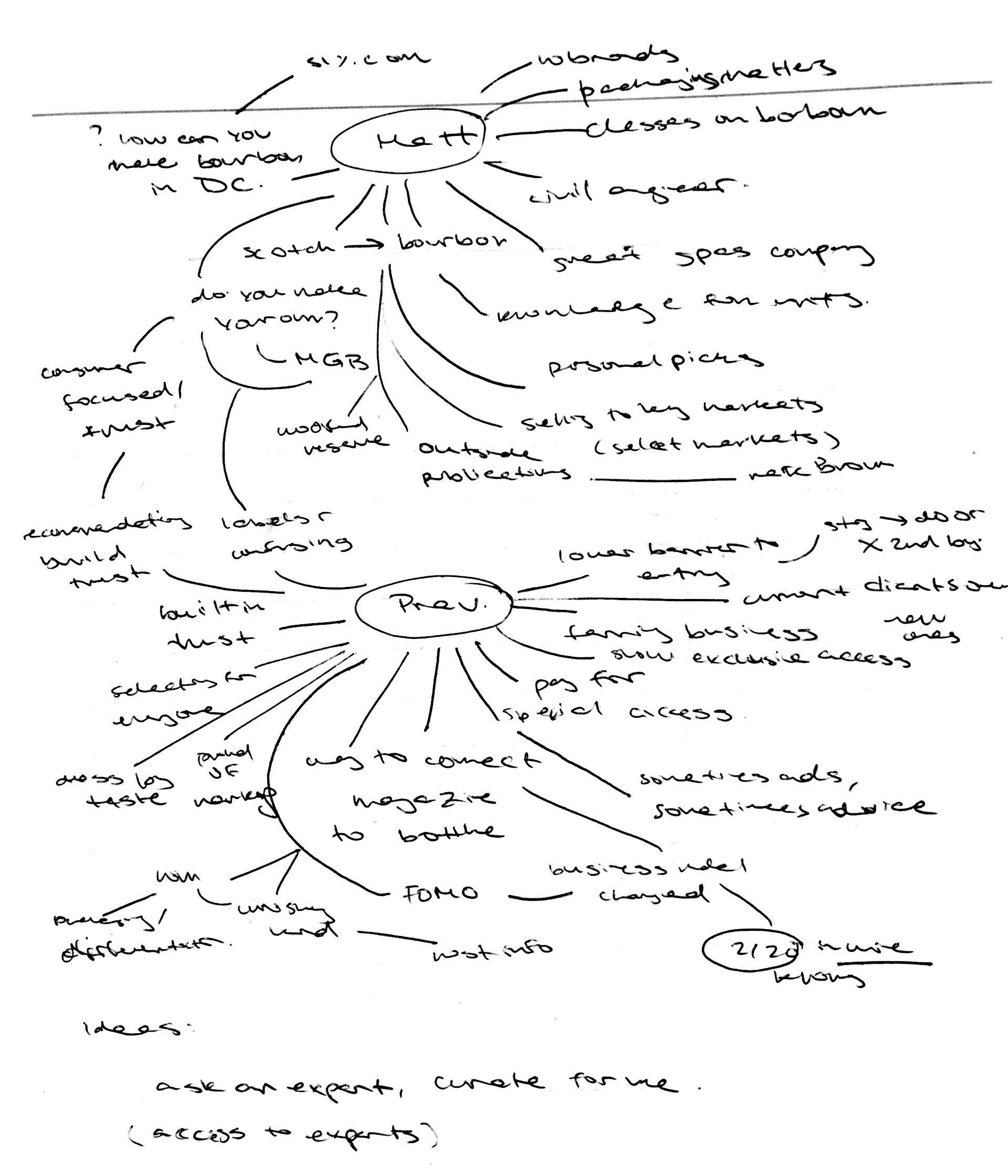
Mindmap of the interview with bourbon experts Matt and Prav in DC
Branding and Marketing
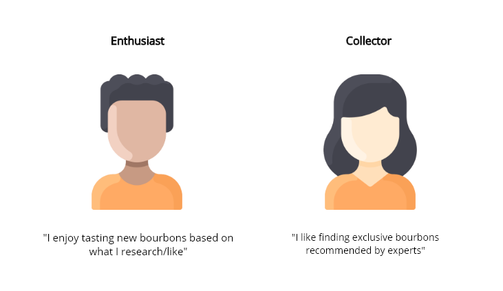
One of the main challenges we ran into while creating this experience, was the ubiquity of alcohol related apps. During our interviews, two main groups of bourbon buyers emerged: tasters/enthusiasts and experienced collectors. According to these personas, we were able to gear our application's functions more towards the experienced collector.
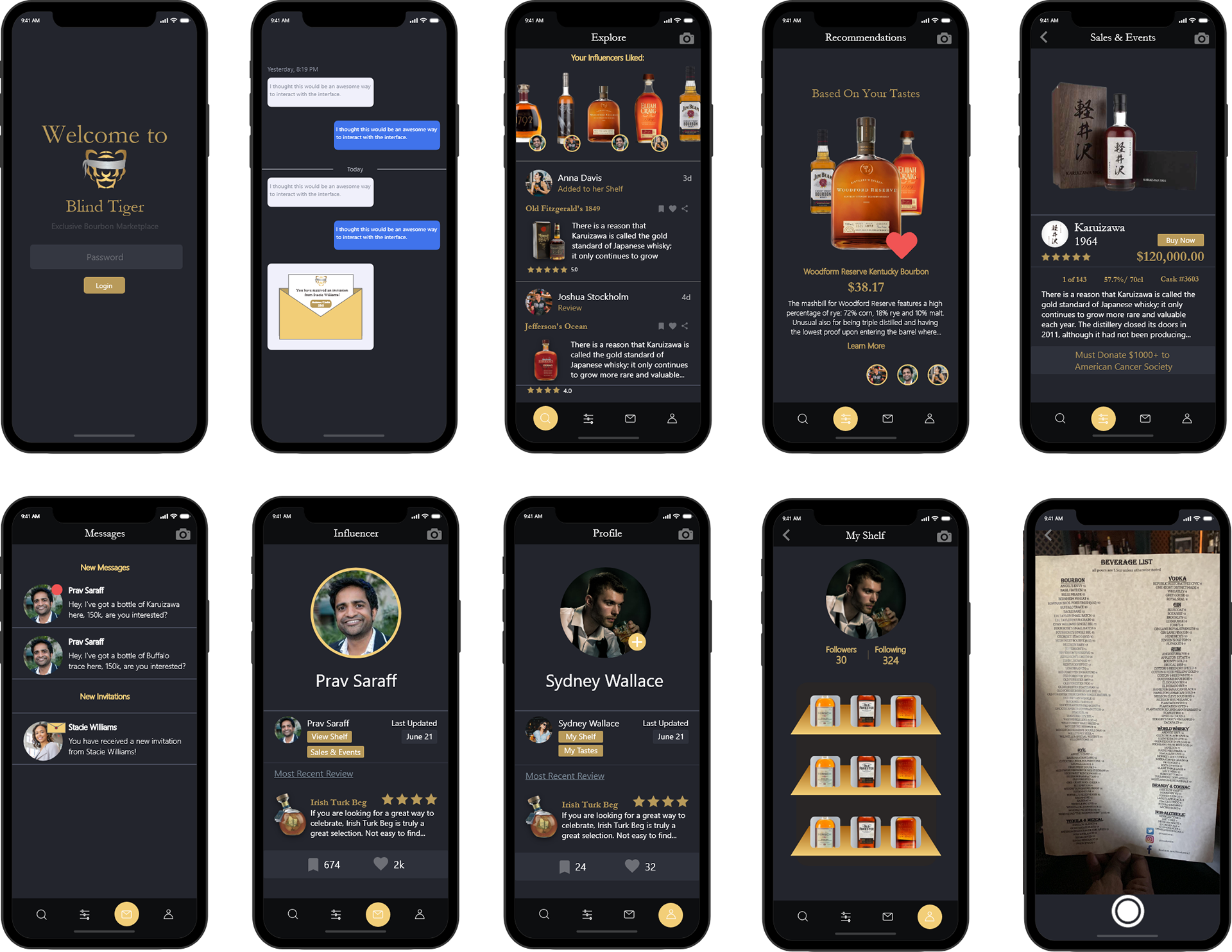
We found the exclusivity and mystery that collectors value in places like speakeasies - tastings and bourbons only available in a limited fashion. This was used to theme our experience, and we had the idea to incorporate some functions of speakeasies into the application, like the need for an invite from an existing member or expert to download/join. The application is also named after one of the slang terms for a speakeasy, a "blind tiger."
Design
Because of a shortened sprint, our project manager pushed for a more condensed design phase. In order to leave ample time for making/testing high-fidelity prototypes, we chose to ideate and work with developers in tandem. For each of the sketches below, we conducted meetings with the development team to verify the feasibility of our ideas. This allowed for some refinement of the possibilities of the knowledge graphs we were working with, and informed our data visualization methods.
Early sketches & ideation
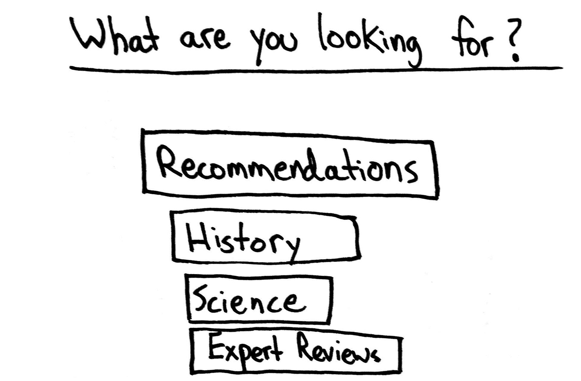
Landing Page
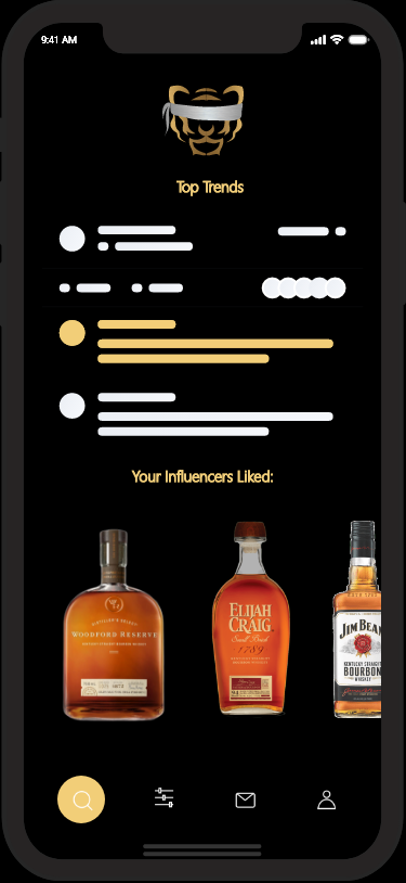
This sketch is an early idea for the landing screen. Upon entering the mobile app, users would be prompted with four different categories that would help narrow the scope of what they want to see. These four categories are recommendations, history, science, and expert reviews.
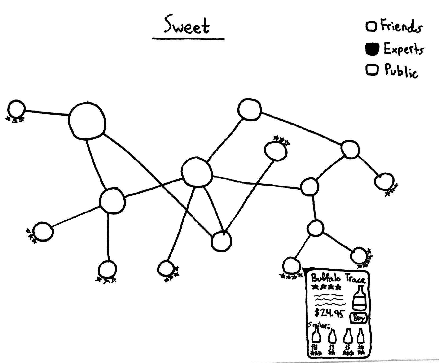
Knowledge Graph
Due to the requirement of incorporating a knowledge graph into this project, this sketch focuses on how a knowledge graph could be used to benefit bourbon enthusiasts. The idea is to display reviews of bourbon based on certain flavor preferences. When clicking on one of the graph’s nodes, the user would see a sweet bourbon that corresponds to that node. Each node would display a rating outside of the node bubbles. User could also filter their results based on reviews from friends, experts, or the general public.
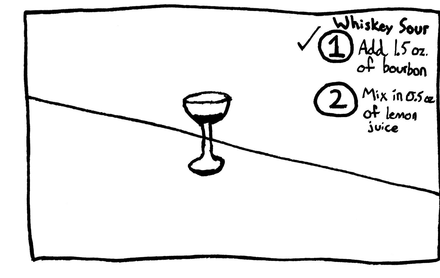
AR Tutorial
This is an idea of an AR or video-based app that provides users with a tutorial of how to make mixed drinks with certain bourbons. The demonstration would be displayed near the center of the screen, while the directions are displayed in the top-right corner.
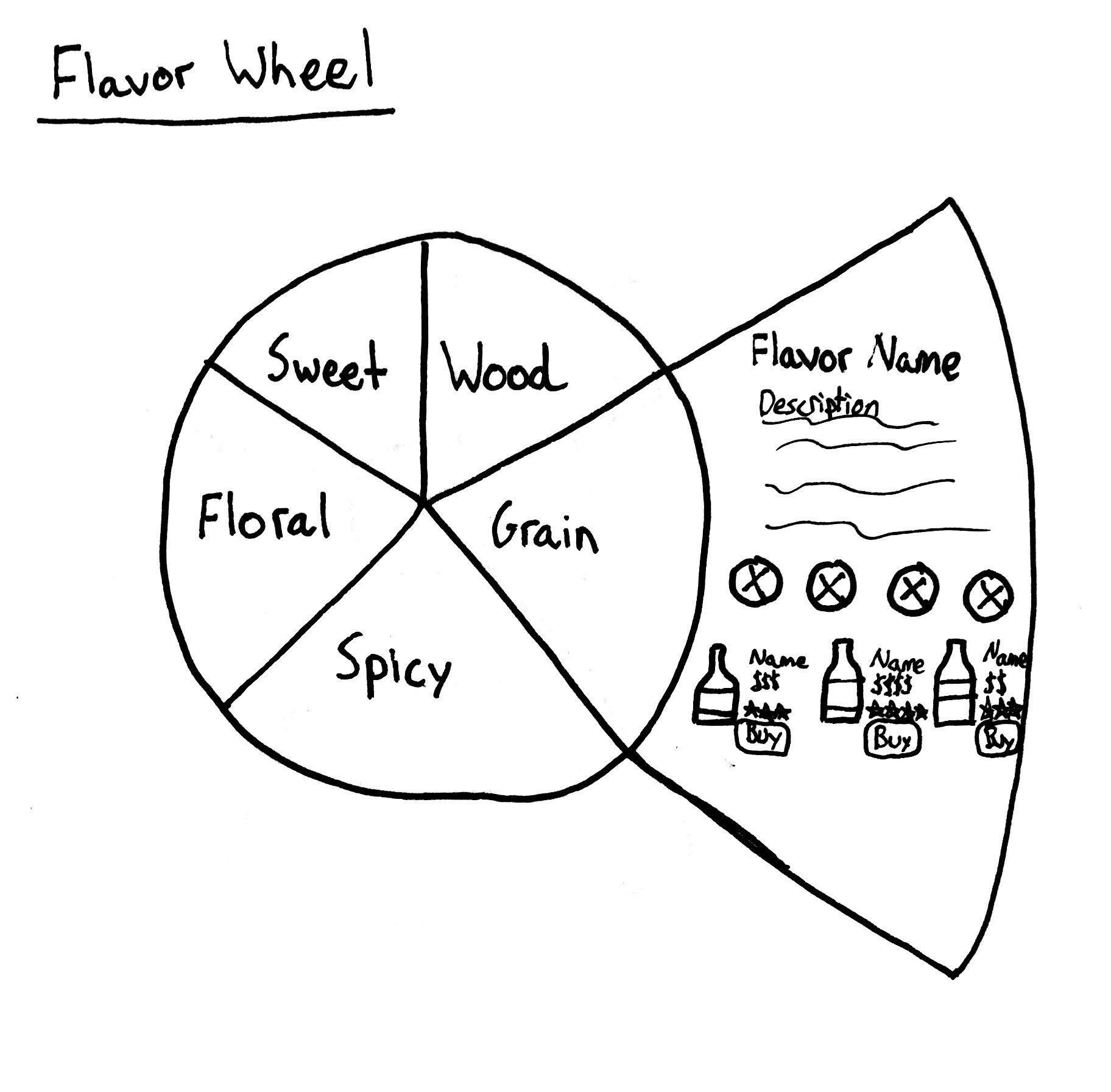
Flavor Wheel
This idea focuses on the concept of basing reviews and suggestions on a flavor wheel. Users would be given the task of completing a quiz that gauged their flavor preferences. The results would then be displayed on this graph.
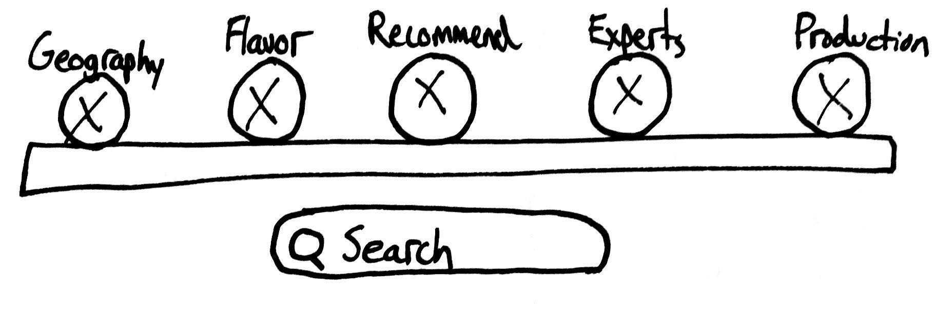
Search Function
Building off the previous sketch, this idea focuses on how we could incorporate the results from a flavor-based quiz into useful features. For example, if the user preferred grainy flavors, they would be given a description of the flavor, suggestions that correlate to that flavor, and the option to purchase the suggestions from local retailers.
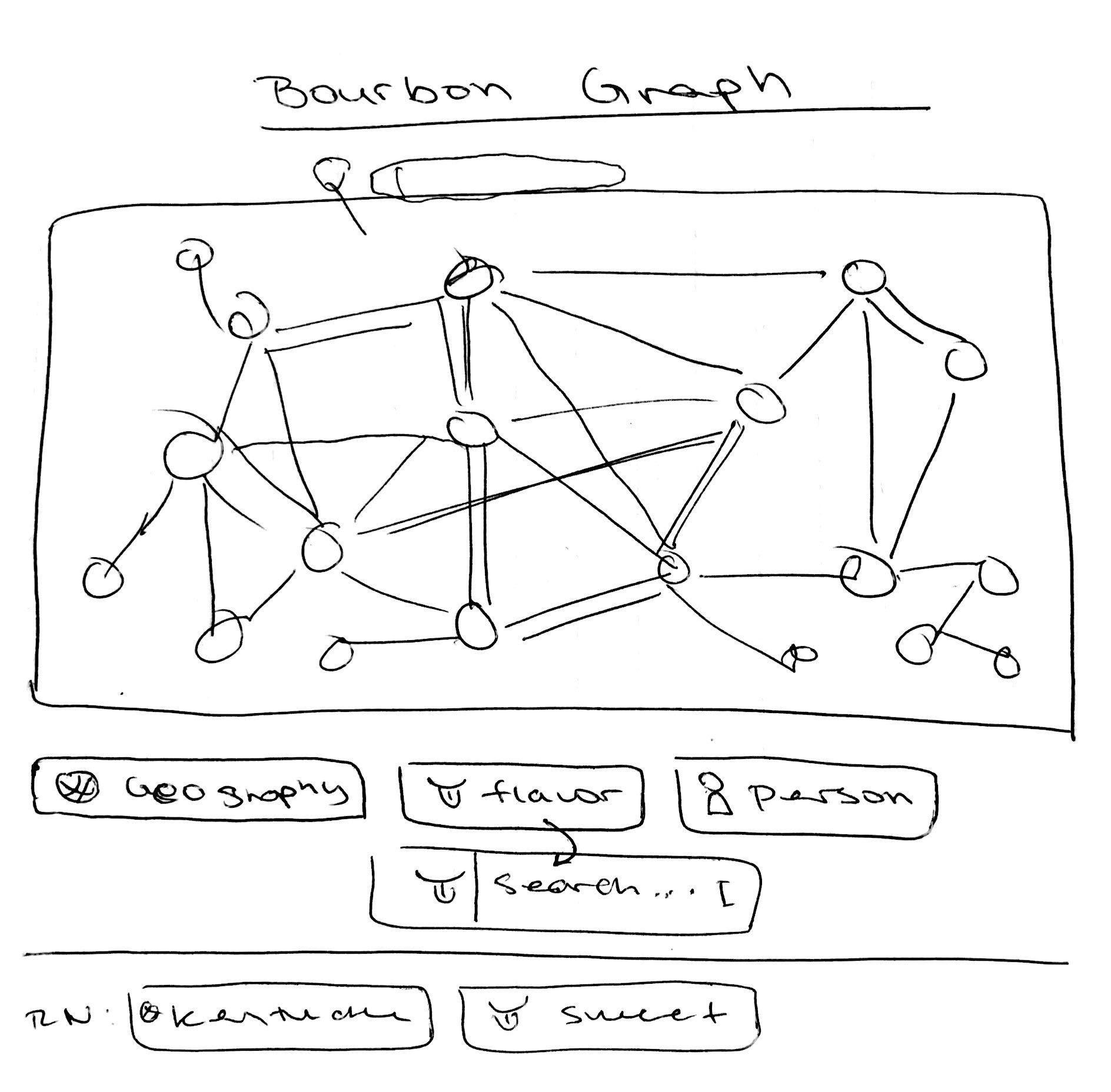
Web Application
This is an early wireframe for the web app version of this tool. The network graph is displayed in the middle, for a user to peruse, and the current filters are displayed by category below the graph.
Visual Design
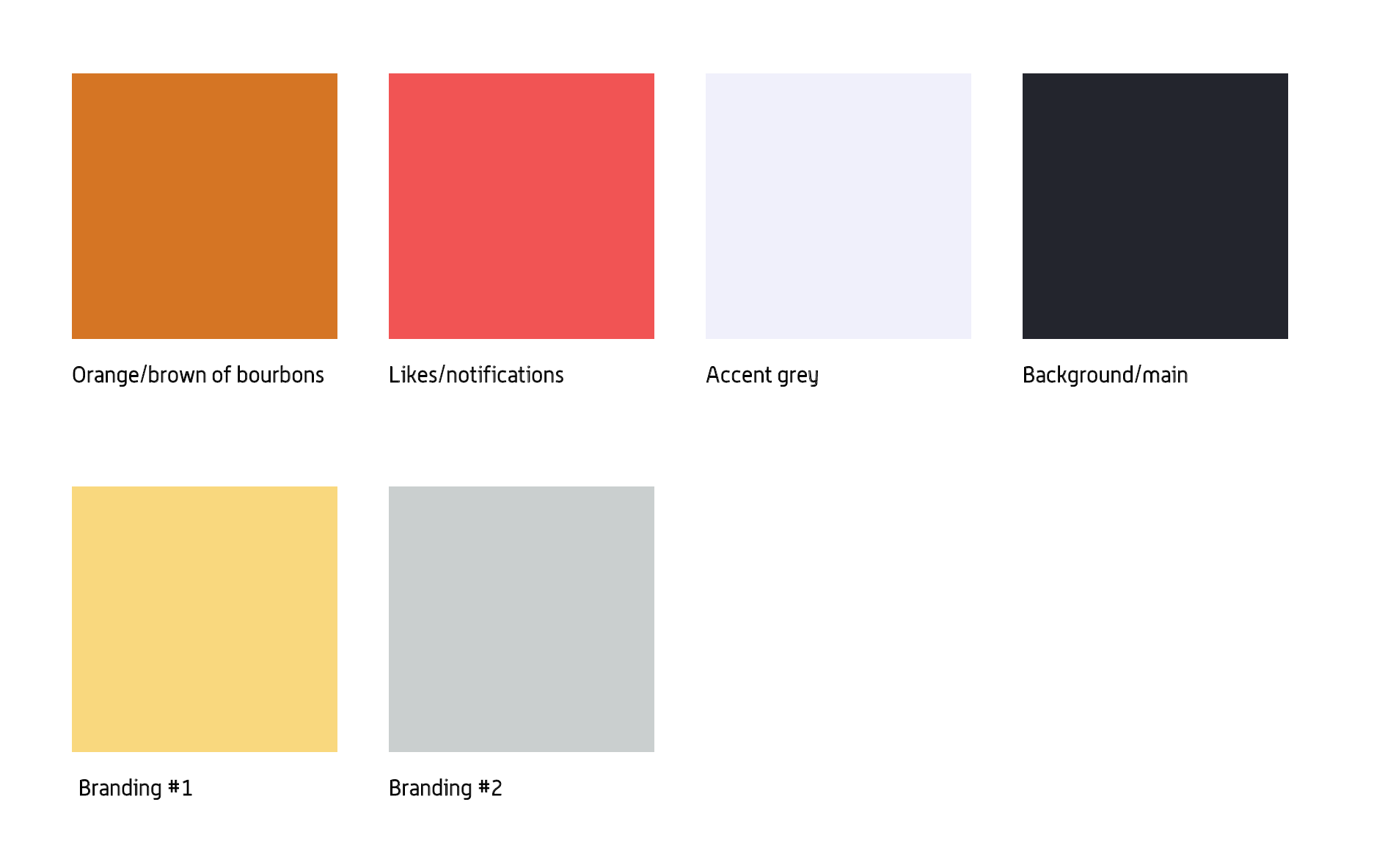
We used existing Redhorse branding guidelines as a launching pad for our app's visual style - we then altered the style based on other 'luxury' branded apps. Given team preference for my vision regarding visual design, I took charge of the branding and theme.
Hi-Fidelity Wireframes
I turned our low-fidelity sketches and wireframes into hi-fidelity screens using the visual style we collaborated on. As a UI/UX designer, I made appropriate changes to our sketches, based on my experience, "hallway" user testing, as well as input from collaborative meeting with the development team.
Next Steps
Reflections
I had an incredibly meaningful experience with my first design internship. Being the first UI/UX designers recruited to a startup is a very unique experience that allowed me to experience building a whole design system from scratch without much guidance. It also gave me and the team the opportunity to study the company and build a brand and visual design that had never been attempted by designers before.
There were a number of challenges, given that the development team we worked with were also interns, and there was no established workflow until we developed one. Additionally, the short timelines and expectations from our clients meant that we had to pick and choose what to focus on in our process.
This concept is currently in the process of being developed by a team at Redhorse, and is expected to become a fully fledged application in the near future.